This case study is on UPI, specifically the fraud faced by low-income Indian merchants. It presents the outcomes of our applied study of Human-Computer principles, based on Stanford University's "HCI: Foundations and Frontiers" course. We aimed to look for gaps in applications with a large user base so that we could recommend practical and consequential solutions within the existing scope. The course covered various HCI topics, including user research, interaction design, prototyping, and evaluation.
Members: Medini Chopra, Nishtha Das
Advised by: Professor Debayan Gupta
Unified Payment Interfaces
Keywords: Vulnerabilities; privacy; digital payments; merchants; digital financial services; fraud; Global South; DFS; ICTD; HCI4D, UPI
UPI is a payment system developed by the National Payments Corporation of India (NPCI), and it works on a "four-pillar push-pull interoperable model".
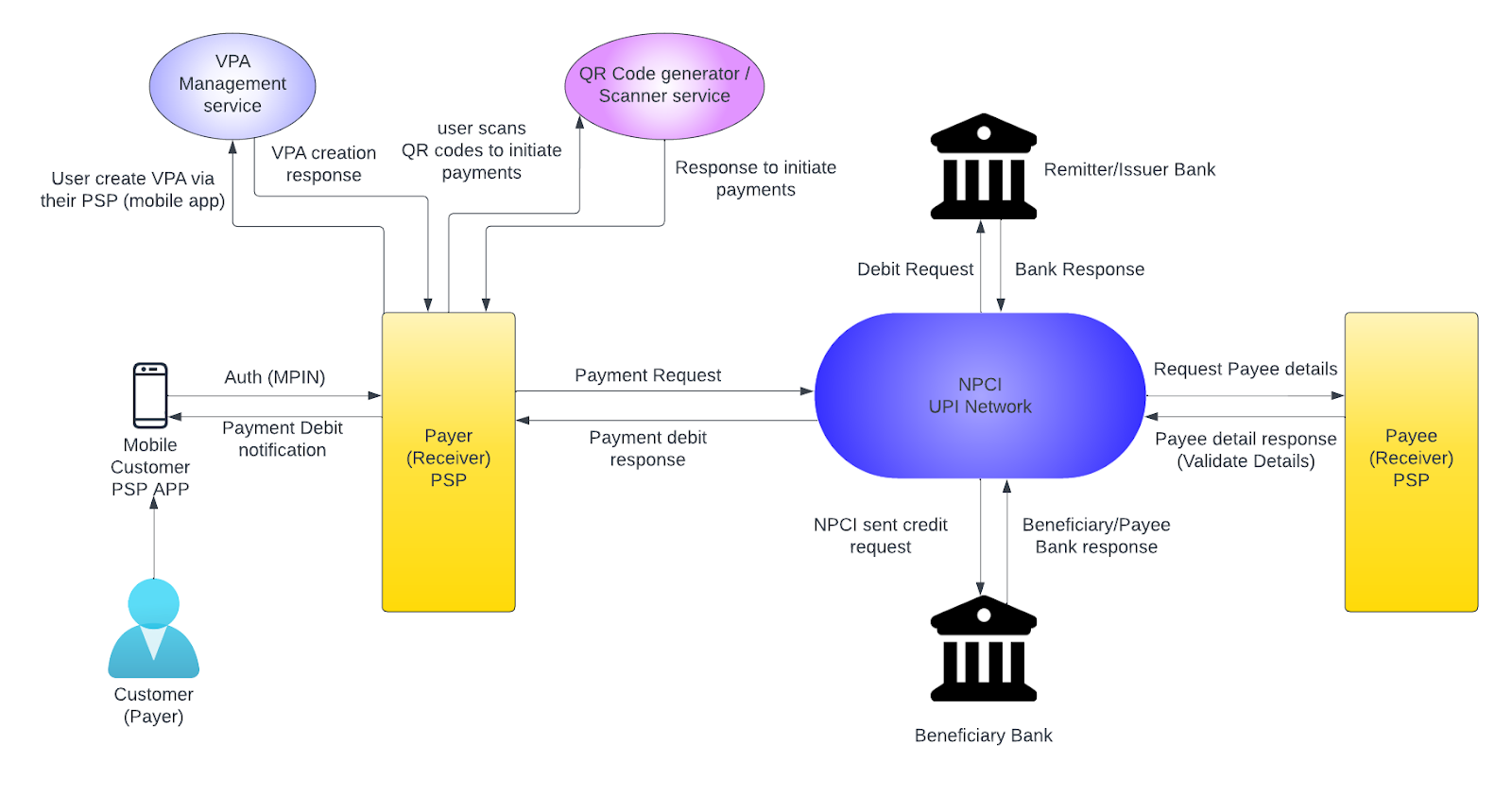
UPI architecture
- After having scanned the QR code of where the money needs to be sent, the sender will initiate a payment, and the UPI app will send the NPCI servers a request
- NPCI is the mediator between the sender and receiver and requests the payee's bank to make the payment
- Once completed, the payee gets a confirmation
- Finally, a request is sent to the receiver
The problem arises once a transfer is made to the wrong bank account, you cannot undo it, and the payment application you use cannot help the situation. The bank needs to be notified directly and the resolution process takes approximately 10 days.
User Persona
Saroj
Background
Saroj is from a middle-class family, running this store for the past ten years. She uses a smartphone for communication and managing expenses that was set up by her son, who is a tech-savvy person. However, she still values efficiency and wishes to maintain her expenses and streamline her business.
Goal
Reduce risk and attempts of experienced fraud and streamline business transactions and financial management
Challenge
Limited resources on the UPI application side, language barriers in understanding the interface, and the fear of pressing the wrong button due to tech illiteracy
Need
A user-friendly UPI interface that allows for improved payment verification methods as well as streamlined customer care to better handle fraud and scams

Motivation
The main paper we referred to was "Who is protecting us? No one!" Vulnerabilities Experienced by Low-Income Indian Merchants Using Digital Payments. To summarize the problems listed in the paper, we see that low-income merchants in India are heavily reliant on digital payment systems, however, they are equivalently vulnerable to the pitfalls of the design and experience of these apps (GPay, Paytm, PhonePay, etc.) This has been a largely underserved community in scientific research even though they are key stakeholders in the digital payments space. This study is also heavily related to the "Design Process" module which covers the importance of empathy when designing interfaces and products for a large audience base. It is also crucial to the "Accessibility" module which covers accessible and inclusive technology, since this project operates at the intersection of income, health, and social status. The key takeaway was that we need to reverse the design process - instead of building for the general audience, build for a specific audience and generalize from that. This ensures that you reach all audiences, and end up building a much more enhanced and robust product.
Socio-technical interactions with UPI apps lead to vulnerabilities of 4 kinds: access-based, identity-based, financial, and informational. The qualitative study arrived at this after interacting with 34 participants: 24 low-income merchants (daily revenue up to 1000 rupees) and 10 agents (those who help onboard merchants). It focused on the following questions:
- RQ1: What vulnerabilities do low-income merchants face when adopting and using digital payment systems?
- RQ2: What kinds of fraud, and corresponding harms, do merchants experience in light of these vulnerabilities?
- RQ3: What strategies have merchants developed to try and mitigate the effects of fraud they experience?
While the study also spoke about issues faced by merchants after onboarding but before any transactions, our focus area was at-transaction and post-transaction activities because the scope of fraud was present most here. Under pre-transaction, the only fraud mentioned was that agents would scam merchants during the account creation process, take personally identifiable information, and defraud them later by extracting their bank account details. Therefore, the at-transaction and post-transaction stages are where we decided to implement UI/UX redesign solutions. The key metric for this study was vulnerability. This was prevalent in the "Accessibility" and "ICTD" modules we covered as well, which focused on smaller communities, and why it was important to have a diverse set of focus groups when developing products, especially for country-specific usage.
According to Making Digital Payments Accessible Beyond Sight: A Usability Study of UPI-Based Smartphone Applications, users preferred Google Pay over other UPI payment mobile apps, and therefore we chose that as our case study.
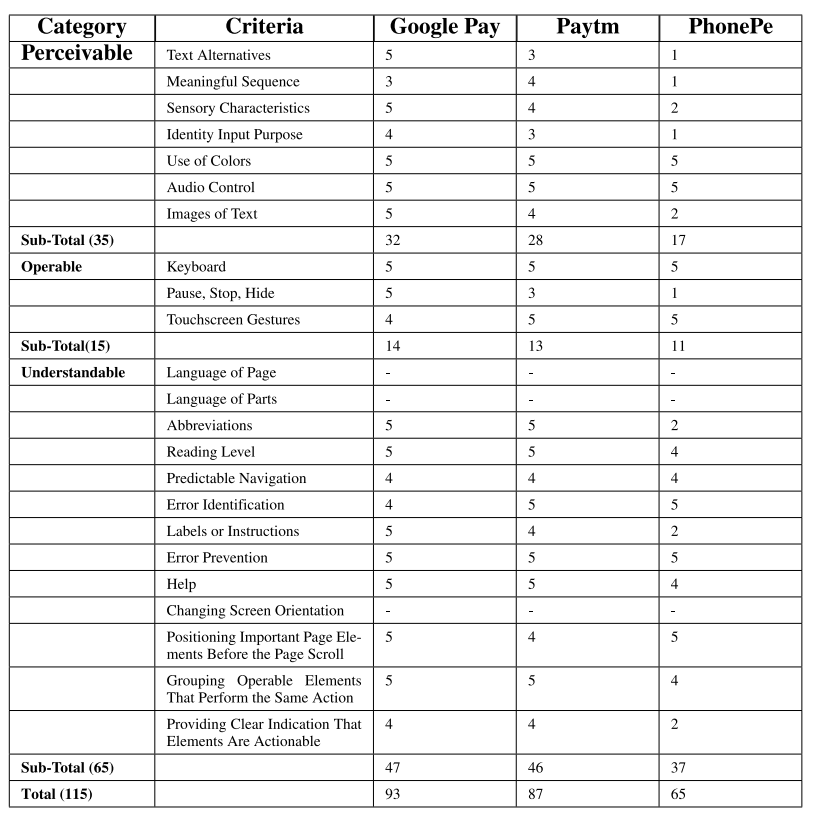
Proposed Features
1. At-transaction

Customers would defraud merchants by showing fake payment confirmation proof, because merchants would check the overall screenshot but not the date and time details. This problem was also highlighted in Understanding Social Engineering and its Impact on Merchant-based UPI Frauds.
Problem 1: Fake screenshots of payment confirmation and incorrect sender's address
Feature 1: Successful transaction page
Recommendation and Reasoning:
- We increased the size of the font to make the time and date of the transaction more readable.
- We added a plug-in that accesses the current time on the system device and sets a counter for how much time has elapsed since the payment was made. Since this is dynamic, it is not possible to show a fake screenshot at the moment to the merchant.
- Instead of the large tick mark, we added the profile picture of the merchant, since that is visually intuitive and not reproducible by fraudsters. The tick mark sign has been made smaller, and still accessible. We also change the color to the typical Google green to give a better sense of accomplishment than the blue.
- On the merchant's side, we recommend an in-app alert or sound notification to let the merchant know the payment was successfully received on their end.
.png)
.png)
.png)
From left to right: original successful transaction page, redesigned with timer, redesigned with merchant photo
2. Post-transaction
There is a lack of support from customer care because merchants would struggle to follow remote instructions. On the merchant's side, there is a significant fear of pressing the wrong buttons to access help, in the case that it might result in more financial loss and struggle. The help button is otherwise not easily accessible, and in moments of panic may be easy to miss.
Problem 2: Merchants fear pressing the wrong button
Feature 2: Front-facing help
Recommendation and Reasoning:
- The goal here is to make access to help and support as accessible and quick as possible because there is no option for this on the home page itself
- We recommend a semi-permanent support banner, as this is visually the first thing on the home page and the colors are sufficiently eye-catching
.png)
.png)
Left: original home page, Right: redesigned with support banner
Problem 3: Lack of consistent support
Feature 3: Accountability through active tickets
Recommendation and Reasoning:
- Since the customer care representatives promise to call back and follow up but don't end up doing it, we recommend an in-built reminder system that builds on the existing active tickets section.
- As the merchants find it difficult to follow-through on text, we are pushing for a quicker, direct call line by foregrounding a call option.
- A clock icon signifies a large amount of time passed raising a more serious alert, telling you how many days have passed since the request was sent.
- This is also highlighted in the "Collaboration" module which addresses the effect of distance in interactions, and what information loss takes place when we move online. Clearly, online customer care and transactions creates an unfamiliar blackbox for the user.
.png)
 - Inactive state.png)
 - Active state.png)
 - Ticket status.png)
 - Ticket status.png)
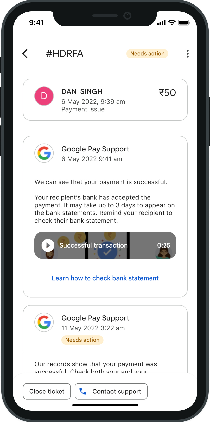
From left to right: the original active tickets screen, redesigned with new ticket card, redesigned with support content
Problem 4: Overreliance on SMS verification
Feature 4: In-app notification and sound alert, and verification keyword from bank
Recommendation and Reasoning:
- Since overreliance on SMS verification leads to another vulnerability in the form of social engineering fraud, fraudsters send intimidating SMS messages
- We propose a protocol for verification by the bank in-app to avoid SMS reliance and ensure authentication of every payment.
- Additionally, this can be used in conjunction with our earlier recommendation of a sound alert when a transaction is successfully executed.
There are additional fraudulent activities that might not have a direct correlation with a UI/UX feature request but they are worth exploring within the domain of HCI for UPI still. The main attack against merchants is the "Watering Hole" attack, where fraudsters replace the merchant's QR code with their own. This cannot usually be detected because the UPI architecture assigns a name that is randomly generated via the protocols above, and is not readable/easy to memorize by a naive user. Merchants must manually verify the payment status of the transaction from the customer's end, and fraudsters would paste fake QR codes over the merchant's original one to redirect payments to their account. Furthermore, SMS confirmations can be delayed because of network issues or multiple payment app options. Besides the major issues faced such as scams, identity theft, phishing, and hacking, the more diverse set of issues stem from OTP, QR scan, and connectivity, which is evident in other research as well such as Security Analysis in Online Transaction Systems: A Proposed Framework.
References
- From Cash to Cashless: UPI's Impact on Spending Behavior among Indian Users
- Infrastructuring Public Service Transformation: Creating Collaborative Spaces between Communities and Institutions through HCI Research
- Public design of digital commons in urban places: A case study
- What Explains the Adoption of Mobile Wallets? A Study from Merchants' Perspectives
- User Survey of UPI-Enabled Payment Apps